

OSLO BEIRUT, MILANO
BACK TO PORTFOLIO
Case Study: Oslo Ice Cream & Cakes – Brand Design and Expansion
Project Overview
Oslo Ice Cream & Cakes, a premium ice cream and cake brand, approached Nobrand Agency for the creation of its logo, brand identity, and packaging design. Founded by Nayla Audi, the visionary behind the famous Milk LA, Oslo quickly became synonymous with quality and indulgence. The brand’s slogan, "Made in Heaven", coined by Nobrand, became the essence of the brand, communicating the ethereal quality of the products and was embedded across all touchpoints, from packaging to store aesthetics.
Oslo initially launched in Beirut, where it gained popularity over the last decade for its luxurious ingredients and artisan craftsmanship. As the brand expanded into Milan, the design and branding needed to maintain the same high standards while appealing to a new, discerning market.
Design Concept and Execution
-
Brand Identity and Logo Creation
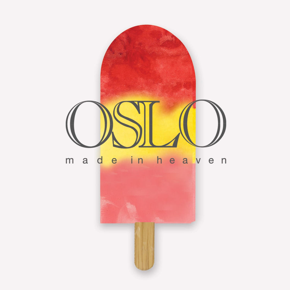
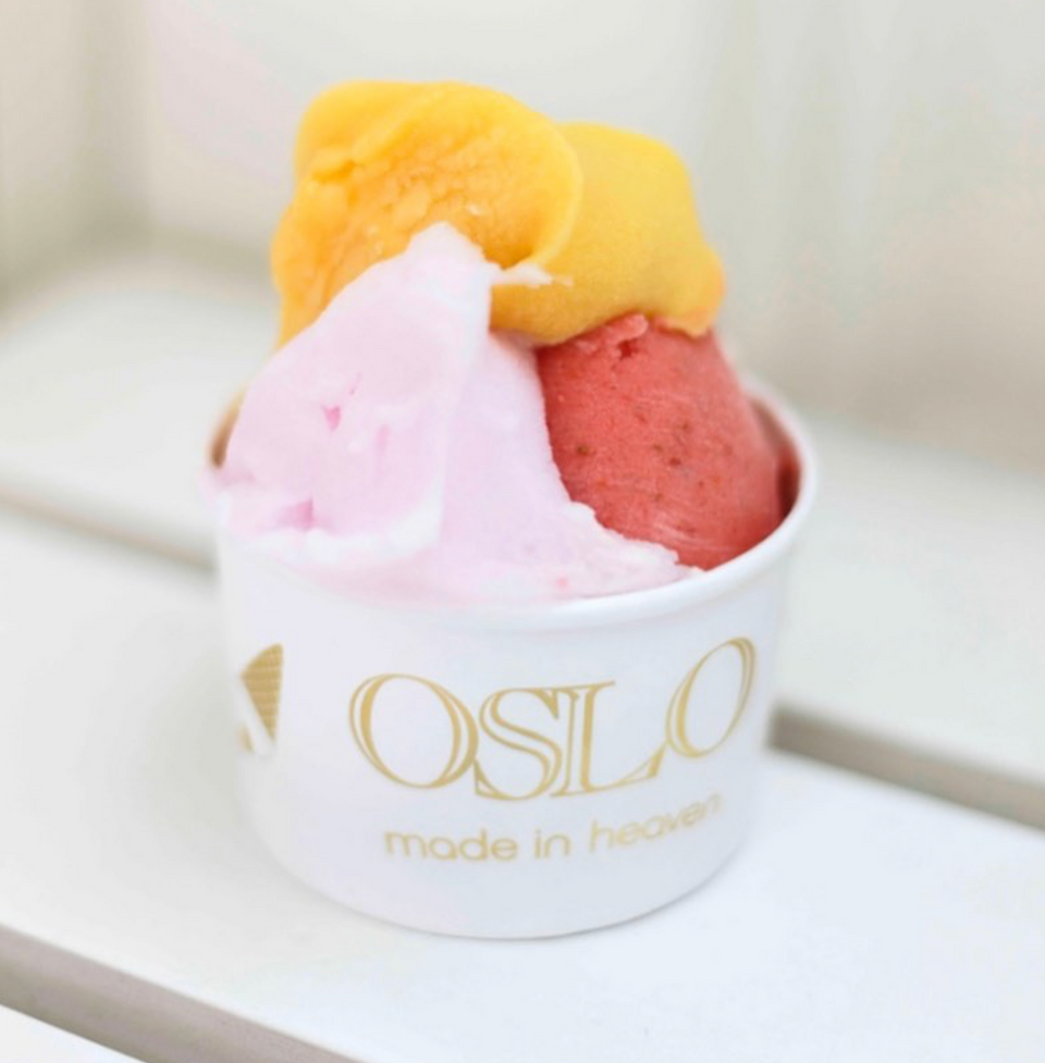
The logo for Oslo Ice Cream & Cakes was designed to encapsulate the premium nature of the brand. The design was kept simple yet sophisticated, with elegant, flowing lines that mirrored the smoothness and richness of the ice cream and cakes. The logo's typography was modern, with subtle curves that evoked indulgence and luxury, setting the tone for the brand as a purveyor of high-quality, handcrafted desserts.The "Made in Heaven" slogan was integrated into the logo and branding materials, acting as a promise to customers about the quality and excellence of the products. The slogan became the defining motto of the brand, clearly communicating that every bite of Oslo’s ice cream and cakes is an otherworldly experience.
-
Packaging Design
The packaging design for Oslo was carefully crafted to reflect the brand’s commitment to quality. Nobrand Agencyused clean, minimalist designs with soft, muted colors to give the packaging a timeless elegance that stood out on shelves. The materials used were premium, further emphasizing the high-end nature of the products.Every element of the packaging was designed to echo the brand’s "Made in Heaven" ethos. Gold foil accents were added to certain elements of the packaging to represent the brand’s excellence, and the typography was kept sleek and modern, mirroring the brand’s refined aesthetic. The result was packaging that was not only visually stunning but also communicated the purity and quality of the ingredients within.
-
Communicating Quality Through Design
Quality was at the heart of Oslo Ice Cream & Cakes, and the brand’s design needed to reflect this emphasis. Nobrand worked to ensure that every aspect of the visual identity spoke volumes about the careful sourcing of ingredients and the meticulous craftsmanship that went into each product.This was achieved through thoughtful design touches such as soft, creamy color palettes and delicate, flowing lines in both the logo and packaging that mirrored the luxurious nature of the desserts themselves. The visual language was crafted to evoke a sense of richness and indulgence, giving customers confidence in the quality of the products before they even tasted them.
-
Brand Expansion to Milan
With its strong foundation in Beirut, Oslo set its sights on Milan, one of the world’s culinary capitals. The challenge was to expand the brand to a new market while maintaining the essence that made it a beloved name in Beirut.To accomplish this, Nobrand Agency ensured that the brand’s core elements—the "Made in Heaven" slogan, logo, and packaging—were consistent across both locations, reinforcing the brand's reputation for quality. However, slight tweaks were made to the Milan-specific branding to resonate with the local market’s refined palate and preference for artisanal, high-end products. The expansion was successful, with Oslo quickly gaining traction and becoming a go-to destination for ice cream and cakes in Milan.
-
Store Aesthetics and Brand Touchpoints
Beyond packaging and logo design, Nobrand helped develop the overall visual aesthetic of the Oslo stores. The interiors reflected the minimalist elegance of the brand, with clean lines, soft lighting, and a palette that matched the packaging. The design created a seamless experience, where the store atmosphere matched the high standards of the product.Additionally, brand touchpoints such as business cards, in-store signage, and even the cake boxes reflected the same meticulous attention to detail. The seamless integration of the "Made in Heaven" theme across all mediums reinforced the brand's identity and left a lasting impression on customers.
Challenges and Solutions
-
Creating a Brand That Communicates Quality Without Words:
One of the primary challenges was to ensure that the brand's identity and design communicated the quality of its products without relying solely on the slogan. This was achieved by incorporating premium design elements like gold foiling, minimalist aesthetics, and the use of high-quality materials across all packaging and branding. These elements gave customers an immediate sense of luxury and craftsmanship. -
Maintaining Consistency Across Two International Markets:
As Oslo expanded from Beirut to Milan, the brand needed to maintain its strong identity while appealing to a new audience. By keeping core elements like the "Made in Heaven" slogan and minimalist design, Nobrand was able to maintain brand consistency. At the same time, slight adaptations were made to the visual identity to ensure it resonated with Milan’s luxury market.
Outcome
The branding for Oslo Ice Cream & Cakes was met with widespread acclaim. The simple yet elegant logo and packaging not only set the brand apart from competitors but also solidified its reputation as a purveyor of high-quality, luxurious desserts. The "Made in Heaven" slogan became a defining aspect of the brand, echoing across all touchpoints and becoming the go-to phrase associated with Oslo’s quality and craftsmanship.
The expansion into Milan was a significant milestone, proving that the brand’s identity and commitment to quality could transcend borders. In both Beirut and Milan, Oslo remains a celebrated name, with the packaging and branding reflecting the excellence of its products.
Conclusion
Nobrand Agency’s work with Oslo Ice Cream & Cakes demonstrates the power of thoughtful, high-quality design to elevate a brand. By creating a sophisticated and consistent visual identity, along with a memorable slogan, Nobrandhelped establish Oslo as a leading name in premium ice cream and cakes. The seamless integration of the "Made in Heaven" ethos across all branding elements has allowed Oslo to stand out in both local and international markets, creating a lasting impression of quality and indulgence.

