TBH COSMETICS
Case Study: The Blue House Cosmetics
Project Overview
NOBRAND Agency was entrusted with developing the full brand identity and packaging design for The Blue House Cosmetics, an elegant extension of the original Blue House Tea brand into the realm of skincare and personal rituals. Building on the legacy of refined taste and ethical sourcing, this new line required a visual and sensory narrative that would seamlessly translate the Blue House philosophy into the world of beauty and self-care.
Design Concept and Execution
The vision for The Blue House Cosmetics was to craft a brand that feels luxurious, nurturing, and intrinsically linked to nature’s quiet wonders. Our approach focused on evolving The Blue House’s heritage aesthetic while introducing subtle cues that signal the shift from tea to cosmetics.
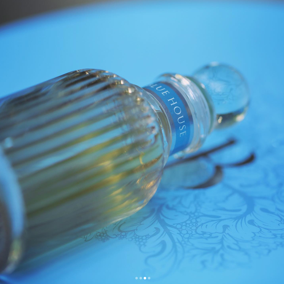
Logo and Brand Evolution
The logo was carefully refined to carry forward the essence of The Blue House brand, maintaining its recognizable elegance while adapting proportions and typographic details to suit cosmetic applications. This continuity preserved brand equity while subtly hinting at the new category through delicately adjusted strokes and spacing that felt softer and more sensorial.
Color Palette and Material Stories
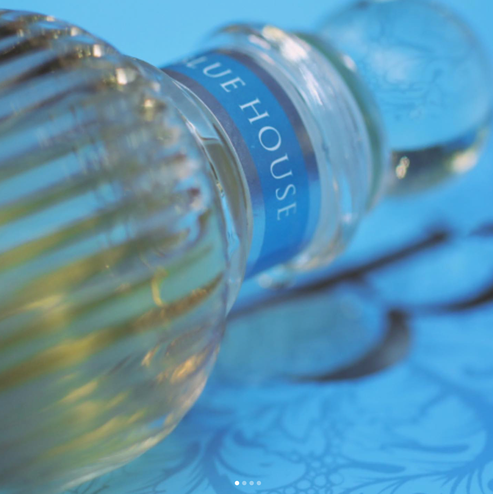
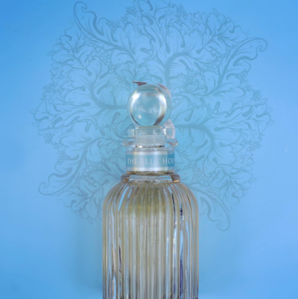
Inspired by botanical gardens, mineral pigments, and the original blue that defines The Blue House, the color palette for the cosmetics line expanded into gentle earth tones and soft pastels. These hues were selected to evoke calm, purity, and organic luxury, applied across packaging and collateral to create a harmonious visual experience.
Materials played a pivotal role in conveying the brand’s premium positioning. Matte finishes, embossed details, and occasional glass components were integrated to ensure that each product felt like an object of desire, aligned with the ritualistic, slow beauty ethos of the line.
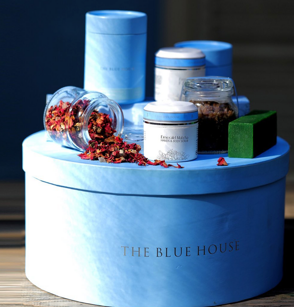
Packaging Design
NOBRAND designed a complete suite of packaging that balanced simplicity with tactile richness. Containers were kept clean and modern, allowing the nuanced color story and understated brand marks to take center stage. Each unboxing experience was thoughtfully considered, from the subtle reveal of inner messages to the feel of textured boxes in hand, all reinforcing The Blue House’s philosophy of mindful indulgence.
Challenges and Solutions
A key challenge was ensuring that the transition from tea to cosmetics felt natural and authentic. NOBRAND addressed this by carefully anchoring the visual identity in familiar Blue House elements, allowing customers to instantly recognize the brand while embracing its new purpose.
Another challenge lay in developing packaging that not only looked exquisite but also upheld the brand’s commitments to sustainability. Through close supplier collaboration and material sourcing, we balanced luxurious aesthetics with responsible choices, supporting The Blue House’s values without compromise.
Outcome
The Blue House Cosmetics launched to enthusiastic reception, celebrated for its unique ability to merge the serenity of fine tea rituals with the sensory pleasure of skincare. Retail partners praised the line for its standout shelf presence, while loyal customers embraced the new products as a natural evolution of The Blue House lifestyle.
Conclusion
NOBRAND Agency’s work on The Blue House Cosmetics demonstrates how strategic design can gracefully extend a beloved brand into new territories. By preserving core brand values and thoughtfully adapting visual and material elements, we helped create a cosmetics line that feels both entirely fresh and unmistakably part of The Blue House story.
Our Story
From Beirut to the World, Nobrand Agency became synonyms with its international aestheticism after working on several international brands.
Read More